Product Card Iteration; Content Clarity for Non-Tech Savvy Users.
Facilitate users to understand the product card information faster.
Disclaimer
- Due to some factors, the final result delivered on app
may differ from original design.
- Due to some factors, the final result delivered on app
may differ from original design.

- Available in Play store and App store


Role
Single UX/UI Designer supervised by design lead
Single UX/UI Designer supervised by design lead
Tools
Figma, Miro, Invision, Whimsical
Figma, Miro, Invision, Whimsical
Key Contribution
- Visual design
- Concept Ideation
- Developer hand-off
- Usability testing and interview
- Visual design
- Concept Ideation
- Developer hand-off
- Usability testing and interview
Duration
2019 - 2021
2019 - 2021

Problem overview
Some of users keep complaining to the client's salesman about how difficult and confusing when doing a transaction in old eDOT app. Starting from this issue, we started do a small research to understand about the real problems to find a suitable solution for the next improvement.
Some of users keep complaining to the client's salesman about how difficult and confusing when doing a transaction in old eDOT app. Starting from this issue, we started do a small research to understand about the real problems to find a suitable solution for the next improvement.
Limitation
Basically eDOT app has complex content and features, but this time I am going to write about the problems our team found on the product card only.
Basically eDOT app has complex content and features, but this time I am going to write about the problems our team found on the product card only.
Design Process
1. Discover
Learn the app, user interview & usability testing
Learn the app, user interview & usability testing
4. Prototype
Mid-fidelity prototype
Mid-fidelity prototype
2. Define
Analyze user behavior, needs & pain points
Analyze user behavior, needs & pain points
5. Visual Design
Final app design
Final app design
3. Ideate
Generate ideas and wireframe
Generate ideas and wireframe
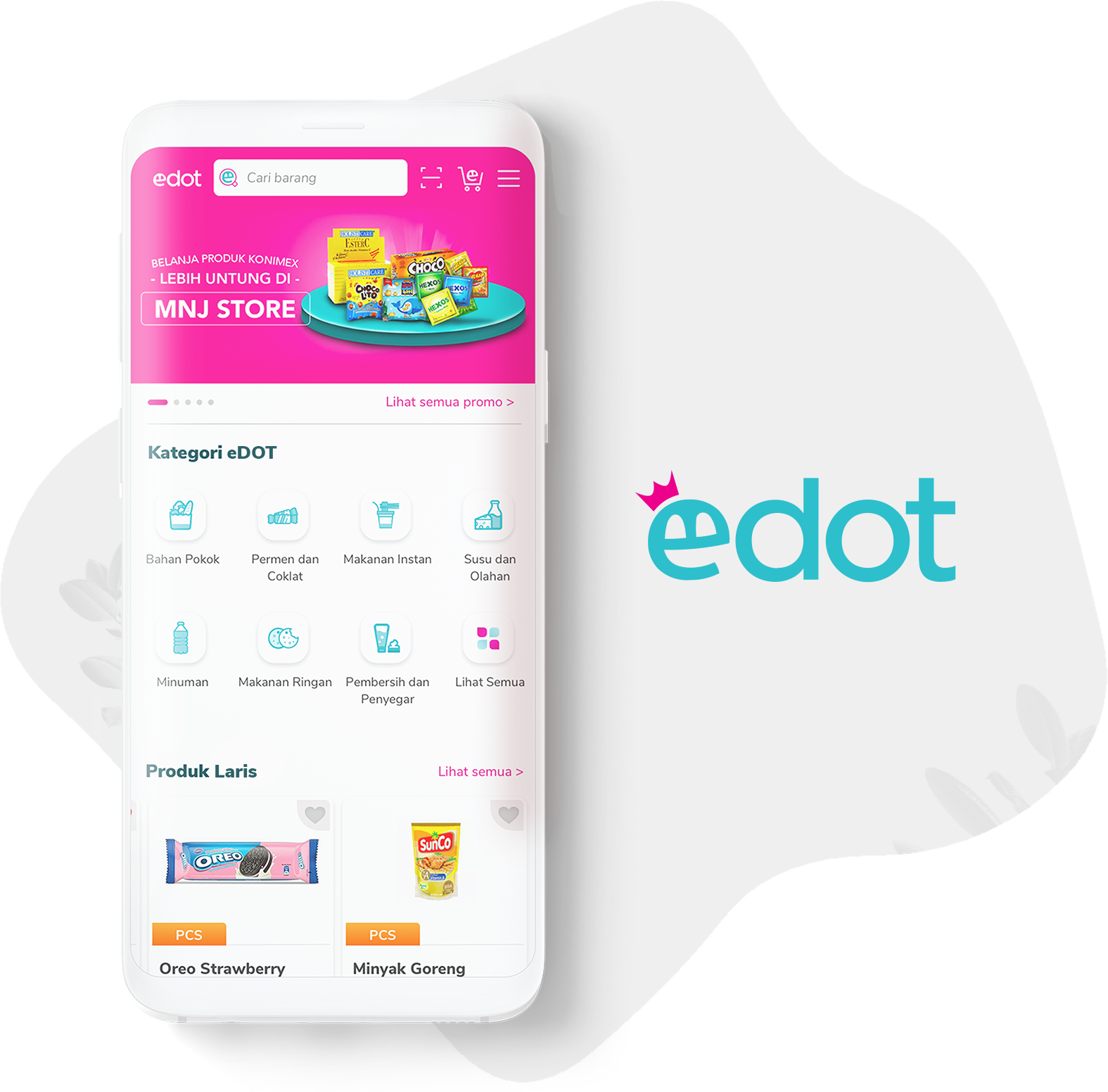
About eDOT
eDOT is a B2B e-commerce owned by Nabati group that focus on selling its products, to reach more consumers, Nabati spreads its wings by opening up opportunities for other F&B companies or local sellers to join them by selling products in the eDOT app.
Currently, eDOT is targeting agents, distributors, and other wholesalers as the main users.
Challenge
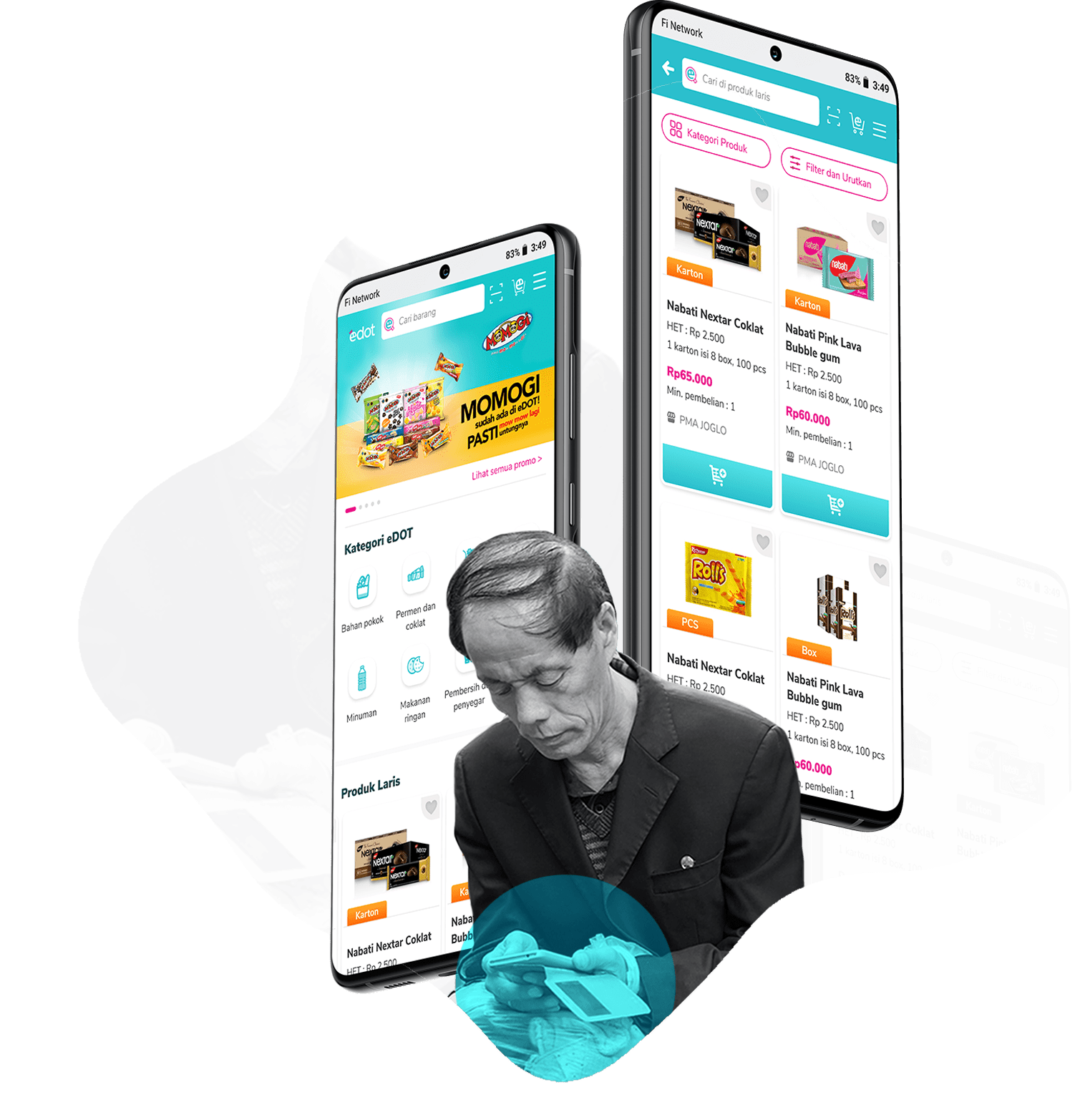
eDOT is dominated by non-tech savvy users aged 40 years and over. The challenge is to ensure the non-tech-savvy users well adjust and have no big trouble with the interface changes.
eDOT is dominated by non-tech savvy users aged 40 years and over. The challenge is to ensure the non-tech-savvy users well adjust and have no big trouble with the interface changes.
Learning about the users
Conducting the usability testing
To find out the weaknesses and strengths of the app as well as to understand user behavior when using the eDOT app, I was accompanied by a partner ran field usability testing by visited 5 participants in different location. The types of participants we visited are as follows:
1. Existing users who have low and
2. Existing users with high interaction using eDOT app.
Task Scenario
The command assigned to the participant was; Purchase 2 boxes of Lotte Choco Pie products and 3 cartons of Nabati Nextar Brownies.
In this process, I used a rainbow spreadsheet to record the failures and successes of the participants in carrying out each task.
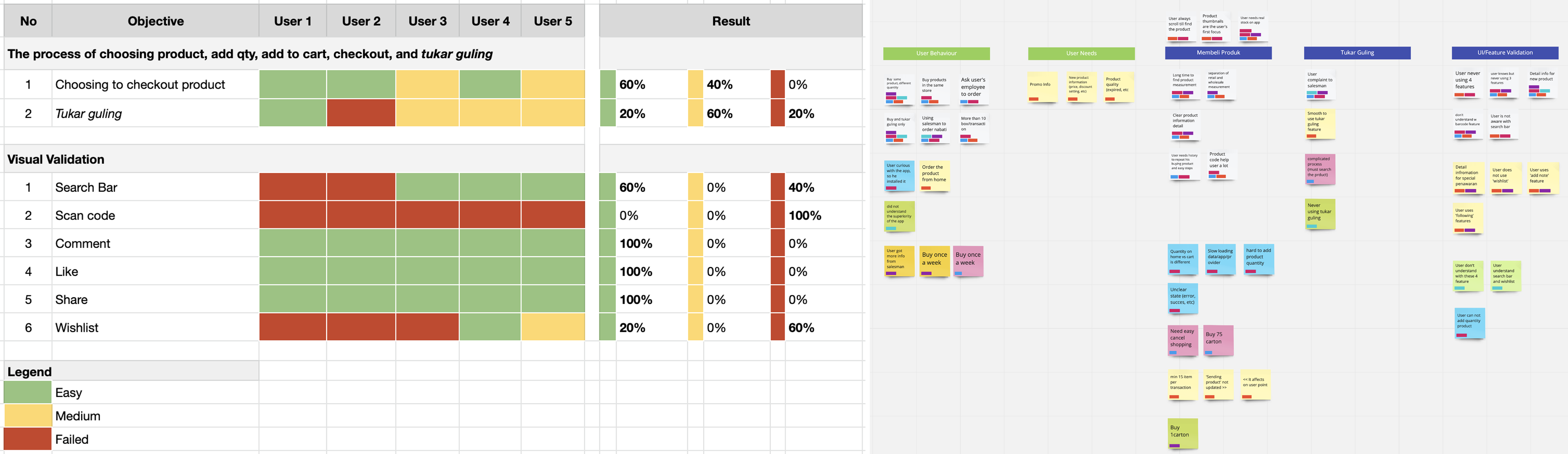
Key findings
We got a lot of informative findings. We then clustered the insights to several points that we prioritized to tackle by using affinity map. This process provides the answer that:
We got a lot of informative findings. We then clustered the insights to several points that we prioritized to tackle by using affinity map. This process provides the answer that:
"3 of the 5 main problems of participants are slow in finding products with certain specifications like HET (Lowest Retail Price), product units and the contents of each product."
Through the analysis process which I combined with the UT results, this problem has been detected the most on product cards. Here are the details:
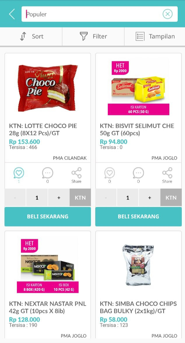
Product Card Issues
1. Less visible of product units
2. Unreliable stock indicator
3. Double and difference unit in the same product
4. Inconsistent of product image
5. Unused comment and share feature
6. Ambiguous wishlist icon
1. Less visible of product units
2. Unreliable stock indicator
3. Double and difference unit in the same product
4. Inconsistent of product image
5. Unused comment and share feature
6. Ambiguous wishlist icon
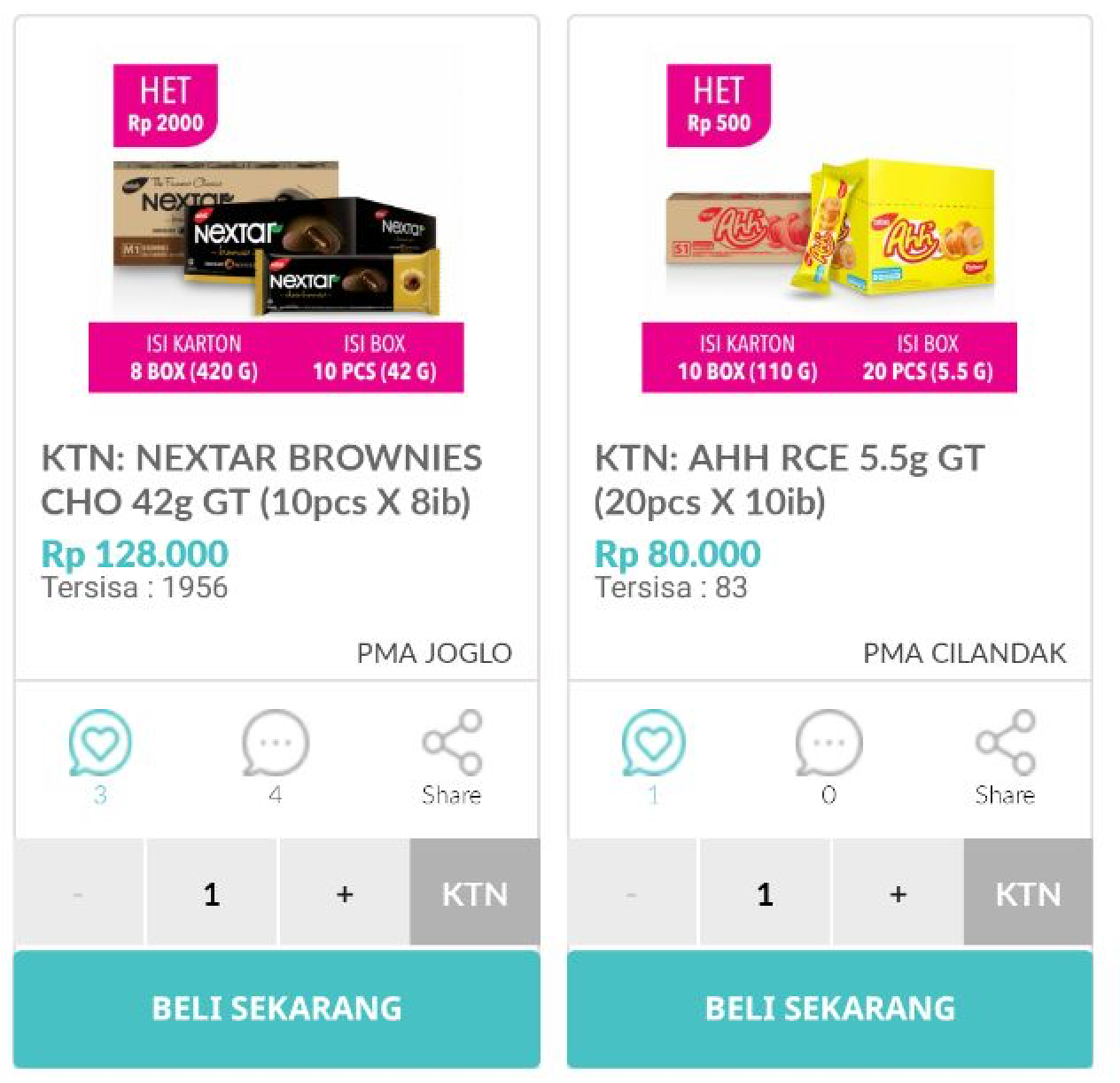
Old eDOT product card
How Might We
How might we redesign the eDOT's product card to help users find the product faster?
How might we redesign the eDOT's product card to help users find the product faster?
From Finding to Design
Constructing the Solution
With all the research and conclusions in mind, I started building some rough sketches on paper, sought feedback from my lead and then brought the final ideations to life in Figma.
With all the research and conclusions in mind, I started building some rough sketches on paper, sought feedback from my lead and then brought the final ideations to life in Figma.

Low-fid wireframe
High-fid wireframe
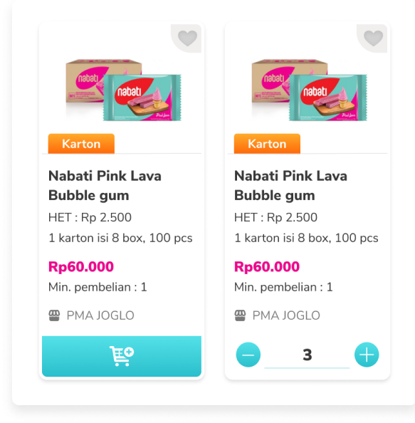
Product card enhancement:
1. Put the most needed product information detail only
2. Make unit and product price brighter color for easy scan
3. Keep the consistency of product image by removed the detail information.
4. Took out unused comment and share features, since there is no engagement and no concern yet from the client.
5. Simplify the 'add to cart' button and added it two conditions to indicate the difference between default and pressed button.
Prototype
Before
After
Developer Hand-off
Due to limited time, my team and I were not able to proceed to the prototype testing phase, so we immediately proceeded to the development phase.
In the development phase, I continue to work closely with the development team so the design and development results go according to plans and goals.
Result
We have a glimmer of hope that based on the analytical data installed,
the eDOT app redesign succeeded in increasing sales transactions by 108% and 139% of transaction value, which this increase managed to exceed the target.
All of this is the result of collaboration between the teams involved in the eDOT project. Of course, this result does not make us quite satisfied, because there are many other things that we can still maximize.
Learning
Below are the learning I can take from the UT process
1. Some old users sometimes do things that are not up to their task, so I have to pull them back to fit the track.
2. Field conditions are not always conducive and there are times when a lot of distraction makes the participants not focus.
Below are the learning I can take from the UT process
1. Some old users sometimes do things that are not up to their task, so I have to pull them back to fit the track.
2. Field conditions are not always conducive and there are times when a lot of distraction makes the participants not focus.
The learning that I can take is to always control myself and mind when facing conditions in the field, so that UT activities continue to run well.